Analysis of leon poster
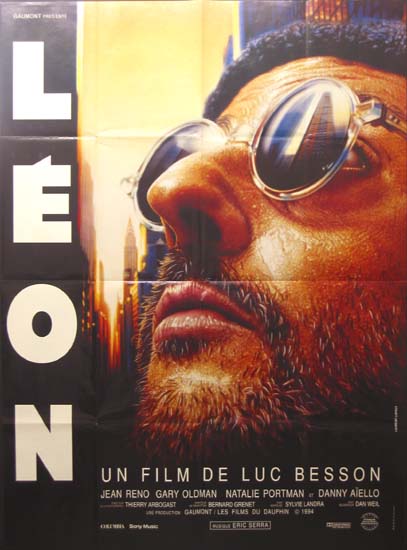
Leon is a French thriller film released in 1994. During this analysis I am going to be exploring how the French theatrical release poster connotes to the viewer’s eyes that this film is a thriller title as well as other significant features in the poster. The posters central image is a low angle close up shot of Jean Reno who stars as the titular character of the film. The use of such a low angle brings strength to this character and therefore the audience can recognize this characters high status. Moreover the use of a close up of Reno’s face looking up allows the audience to identify Reno’s character as the protagonist, not only this but the facial expression on Reno’s face is calm and shows he is in control but also creates a mystery behind this character, i.e. What is this character thinking about? Suspense and tension is a convention of the thriller genre and this is evidenced on this film poster with the shot of Reno’s face looking up and reflecting off his glasses is a low angle shot of building. This may cause the audience to ponder, what the link is between Reno’s character and this building. Additionally the use of a low angle on the building gives the building strength and makes it appear as if the building is going to be a challenge for our protagonist but this challenge isn’t made completely clear on the poster and thus leaves the audience in the dark about the motives of Reno’s character. The use of a warm color filter in the poster connotes danger and action .These features connote that this poster is for a thriller as the poster reveals very little about the film itself asking its audience to try and come up with their own answers.
Furthermore in the French film poster of Léon, the title of the film is written in large block capitals going vertically down. This certain type of typography has been employed as it makes the character Léon himself seem strong with his name written in such large capital letters. Moreover the type has been laid out to look almost like the shape of a building; possibly referring to the building we see in León’s glasses. This may in fact give the viewer some clues towards this character, possibly suggesting that this building is León’s base of operations. Additionally, in the poster we see a sunset, this may connote something is about to end; possibly referring to León’s job as an assassin, he kills people for money thus ending life. In addition the sun has been known to connote life itself, by the sun setting this connotes life ending.
In terms of challenging the thriller genre, the film poster is very conventional to the thriller genre. It features many elements such as shadows in the bottom of the poster, the theme of voyeurism as Léon looks towards the building as if he is watching it. However the contrast between the lights and the shadows do in some way develop upon the thriller iconography of shadows. Shadows have been used in thriller films and posters to conceal and hide away things that may give away the narrative. However in this case shadows have been used to contrast with the warm filter and further exaggerate the meaning given off by this filter, i.e. the feeling of danger and death.
Analysis of Psycho film poster


In terms of thriller genre conventions the poster features only one thriller convention , however still makes the poster fairly conventional. The poster uses thriller iconography, shadows to conecel Nesson's identity which not only creates tension by creating a mystery behind his character but also causes a
verfremdungeffekt in which viewers may start to distance themselves from Nessons character. The viewer may have already established Nesson as the protagonist of the film from the eveidence of him as a central image of the poster. With Nesson's face covered, this takes away his humanity thus making him less of a character we "root for". This allows audiences to distance themselevs from Nessons character questioning his moral fidelity
.jpg/215px-Psycho_(1960).jpg)
Psycho is an American horror thriller film directed by Alfred Hitchcock and released in June 16, 1960. Although this film is a sub-genre of the thriller genre its film poster does share many thriller conventions to connote that the film is a thriller in some ways. During this analysis I am going to be exploring how exactly this poster creates suspense as well as other significant features. In the poster one can see a mid-shot image of a woman highlighted in bright yellow with a concerned look on her face. The woman’s facial expression poses some significance as her fearful face connotes a nearby danger approaching however this danger isn’t entirely depicted in the poster which therefore keeps the audience in suspense in what is happening. Moreover the shot of this woman is surrounded by a black graphic which separates her from the rest of the poster which connotes entrapment, however this brings up the question why is she trapped, a question that isn’t answered exactly by the poster. Additionally she is the only character in the image highlighted in bright yellow. This allows the audience to identify this character as possibly the protagonist or the victim of the film as she stands out completely and appears vulnerable. This already makes the audience want to know what her fate is and thus keeps us on the edge of our seats. Furthermore in the poster one can see a man highlighted in red with an aggressive look on his face. Instantly the audience can identify this man as the antagonist and can also identify the threat he poses to this woman. Also the use of a warm and cold color pallet in the poster contrast with each other. The cold colors such as blue and blacks connote death a theme in both horror and thriller and the warm colors such as the yellows and oranges connote danger and vulnerability. Finally the broken typeface of psycho suggests disruption and a broken mind and link in with the title.
In terms of representation, the representation of women in this poster present them as helpless. This imagery of women has unfortunately become a convention of film and story telling the damsel in distress. The inclusion of this helpless woman creates drama in the poster which entice audiences to view this poster. Furthermore men are represented in the poster as strong as evidenced by the man's animalistic pose as well as the fact that his shirt is off; the audience can see the man's muscles which connote how strong he is. This idea of a strong man and a helpless woman very common in the 1960's and is still common now due to the fact that we live in a patriarchal society however films such as Alien challenge this idea with the inclusion of strong female leads.
The poster is very conventional as a thriller poster as it features many conventional thriller elements such as entrapment with images surrounded by broken borders which empahisise how much danger this woman is in and shadows with the use of a large amount of black to conceal some features like the body of the man on the left and the "psycho" character as evidenced by the man on the left with his angry facial expression.
Analysis of taken film poster

Taken is a French thriller film produced Luc Besson released in 2008. During this analysis I will be exploring many of the significant features used in one of the taken film posters as well as how it creates suspense. In the poster one can see a mid-shot of Liam Neeson’s character looking down, note that is face isn’t clearly shown and is covered by a black shadow which blends in with the black background. The use of this device is to create mystery to the character as we the audience cannot see any facial expression and therefore we cannot identify this man’s motives or the emotion he is experiencing all that we are left with is a sombre mood created by the monochromatic pallet. This sombre environment creates tension within the image and the audience is left asking what this man is looking at. Another piece of graphic used in this image which holds significance is the gun. This allows the audience to instantly identify this man as dangerous. Furthermore Liam Neeson’s name is written in a bright red type which may have been used to further reinforce the idea that his character is dangerous as the colour connotes. Additionally the use of Neeson’s character as the central image allows us the audience to establish that his role in the film is the protagonist. In addition there is large quote written on top of Neeson’s body. It reads “I don’t know who you are but if you don’t let my daughter go, I will find you, I will kill you”. We the audience can identify that this quote is said by Neeson’s character because of the placement of the quote, not only this but this quote allows us to gain some insight into Neeson’s character without giving too much information away. This device causes suspense in the poster as the audience is still left guessing who exactly is this man.
Moreover the poster represents men as powerful figures; defined by Nesson's pose and the gun he is holding which gives him power. This idea of a strong male lead is conventional to not only the thriller genre but storytelling in text due to the fact that our society has a patriarchal nature, men are normally depicting in more of a "better light" than women in text. Furthermore Nesson's big gun is a phallic symbol and further emphasises how much a "big" and "powerful" man he is. The type of Taken is written in bright red in a sans serif font which connote a cold and sombre atmosphere.
Moreover the poster represents men as powerful figures; defined by Nesson's pose and the gun he is holding which gives him power. This idea of a strong male lead is conventional to not only the thriller genre but storytelling in text due to the fact that our society has a patriarchal nature, men are normally depicting in more of a "better light" than women in text. Furthermore Nesson's big gun is a phallic symbol and further emphasises how much a "big" and "powerful" man he is. The type of Taken is written in bright red in a sans serif font which connote a cold and sombre atmosphere.
In terms of thriller genre conventions the poster features only one thriller convention , however still makes the poster fairly conventional. The poster uses thriller iconography, shadows to conecel Nesson's identity which not only creates tension by creating a mystery behind his character but also causes a
Great work, Chris. A brilliant start to your research! In particular, your use of media terminology is excellent.
ReplyDeleteTarget: Comment on all areas of a poster and comment on how a poster challenges thriller conventions.
Addition to Leon analysis
ReplyDeleteFurthermore in the French film poster of Léon, the title of the film is written in large block capitals going vertically down. This certain type of typography has been employed as it makes the character Léon himself seem strong with his name written in such large capital letters. Moreover the type has been laid out to look almost like the shape of a building; possibly referring to the building we see in León’s glasses. This may in fact give the viewer some clues towards this character, possibly suggesting that this building is León’s base of operations. Additionally, in the poster we see a sunset, this may connote something is about to end; possibly referring to León’s job as an assassin, he kills people for money thus ending life. In addition the sun has been known to connote life itself, by the sun setting this connotes life ending.
In terms of challenging the thriller genre, the film poster is very conventional to the thriller genre. It features many elements such as shadows in the bottom of the poster, the theme of voyeurism as Léon looks towards the building as if he is watching it. However the contrast between the lights and the shadows do in some way develop upon the thriller iconography of shadows. Shadows have been used in thriller films and posters to conceal and hide away things that may give away the narrative. However in this case shadows have been used to contrast with the warm filter and further exaggerate the meaning given off by this filter, i.e. the feeling of danger and death.